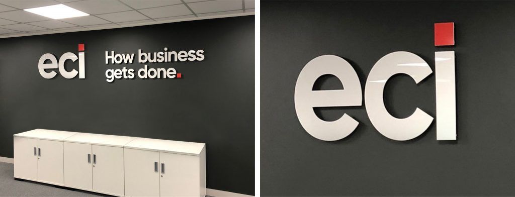
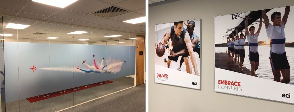
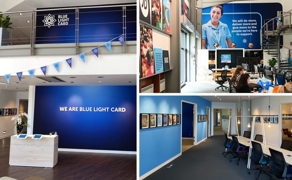
It’s a familiar story. Teams stuck in drab box-like offices that do little to spark ideas or productivity. From grey purpose-built offices on business parks to older buildings that had their original features plastered over in the ‘80s, workplaces often fall short of employee and client expectations.
It’s no wonder so many people would rather work from home.


Still, there are some excellent examples of companies reimagining their workplaces for today’s more discerning employees. These projects are successful because creative teams approach them with an eye on longevity, and are sensitive to the needs of employees and the building design. The interior reflects their ethos and brand values without ever feeling contrived.
I’ve worked with everyone from large national corporations to creative SMEs to deliver interior branding projects. Clients are always keen to get these projects off the ground though there’s understandably an element of trepidation at times. They don’t want to be blamed for a design that falls flat because it’s generic or stops people from working effectively.
Whether you’re working with an agency or your own creative team, it’s important to think carefully about each stage of the interior branding process and engage the right suppliers. Attention to detail is key. You have to understand the floor plans and other details about the building, right down to where power supplies are located, and how different teams interact. We suggest breaking the process down into five steps, as outlined below.
1. Scope
As with any project, you need to define the scope and think about what you’d like to achieve. It is not only about understanding how a space is used and who’s using it. The journey they took to get there is critically important – especially if the business has external visitors. You might want to make a statement, impress stakeholders and promote idea-sharing with breakout spaces. All this information feeds into the plans.
You can work to any budget but it’s important to be realistic about what you’ve got to spend at the beginning, so the scheme is realistic. Defining and sticking to your timescales is also essential, especially if the project coincides with a brand launch or move into new premises.
2. Planning
The next step is to carry out a site survey to find out more about the building and any limitations there might be. It’s important to note, for instance, where the radiators and safety signs are, and whether the wall finish is suitable for the kind of graphics we want to include in the design.
A building might be listed, or have asbestos, so due diligence is critical. Think about the practicalities, as well as branding, such as whether you want poster frames and noticeboards. In some cases, existing fixtures and furnishings will be repurposed in a more creative way, which also helps keep budgets on track.

3. Design proposal
With all the information gathered, the next step is to start designing in line with the brand guidelines. Here, we bring together function and aesthetics to create a space that works for everyone. While you might be tempted to fill every available space with messaging or imagery, you have to allow breathing room too, otherwise your branding will lose its impact. Once you have the initial designs, look at them with a critical eye and present them to stakeholders for feedback.
4. Refine the scheme
Taking on board the client’s comments, the next step is to refine the plan. Elements of the design might be amplified, toned down or removed completely if your budgets are tight.
5. Implementation
Photographers, printers and other suppliers – whether they’re your own or sourced by your agency – will execute the designs. We’ll often arrange new photoshoots if the design scheme includes large-format photography or develop a new suite of messaging and graphics if the scheme goes beyond the brand assets we have available to us. It’s really important, in my opinion, to involve suppliers in the creative process from the very beginning, using their knowledge and expertise so there are no nasty surprises.
The final step is the installation, where you see everything come together and make any final tweaks.

There is no one-size-fits-all approach to interior branding, and there are certainly challenges with some buildings. We’ve worked on Victorian buildings with walls that are far from even and symmetrical, but they have want character and are a reflection of the company. These buildings are a real talking point for staff, clients and investors in conversations and on social media. Whatever the age, shape and size of the building, the design should capture the essence of the brand itself.
Get in touch to find out how Warbox could support your interior branding project.
