


Slow website speeds aren’t just frustrating for visitors. They’re bad for business too.
Especially when we have technology like artificial intelligence (AI) at our fingertips and 5G, with its mobile load times 100 times faster than 4G devices.
Google reports that the chances of a visitor abandoning a website jumps by almost a third if page loading speeds rise from one second to three.
Other research shows that if a mobile site takes 10 seconds to load, bounce rates (the number of visitors who enter and then quickly leave) jump to 123%.
But that doesn’t mean websites need to be turbocharged. The average website load time is 2.5 seconds on a desktop – and anything between zero to four is best for conversions.
Also critical is a good user experience (UX). How websites look and navigate increasingly determines whether or not someone will take action, including making a purchase. Always ask: is information easy to find? Is it easy to checkout? Does it meet accessibility standards?
Customers are in fact willing to pay 80% more for a good UX – and it can boost conversions by 400%.
Website performance
But even the UK’s biggest websites aren’t perfect. Last month, the government website crashed after high demand following money saving expert Martin Lewis’ ITV segment about pensions. It’s not alone – even famous global brands struggle to design fast and easy-to-use websites.
As a brand communications agency, whose job it is to design intuitive websites that convert, we wanted to find out which sectors have the best and worst sites.
We analysed more than a thousand of the UK’s most popular websites across 14 sectors, using Google’s PageSpeed Insights tool to determine speed. Next we created an index score for each website out of 500 based on Google's Core Web Vitals, which are the performance indicators it uses to measure speed and UX.
Full definitions can be found in the glossary at the end of this blog.
Sectors with the worst websites

Fashion brands have the worst performing websites, despite more than a third (37%) of consumers doing most or all of their shopping online. The sector also has the lowest average performance score at 55, although Google says anything between 50-89 needs improvement.
Its average INP (Interaction to Next Paint), a metric that determines how fast it responds to interactions, is the highest at 321 milliseconds, when it should be below 200 for a good UX.
The charity and education sectors follow closely behind with index scores of 395 and 399 respectively. However, charities have the best Cumulative Layout Score (CLS) – a measure of visual stability – out of all sectors at 0.06. The lower the CLS, the better, in this instance as visitors won’t have any strange layout shifts. This is probably because charities prioritise accessibility in their website designs.
Surprisingly, the marketing sector had the fourth worst websites with an average performance score of 79, although its INP is good at 152 milliseconds. Despite advising clients on search engine optimisation (SEO) and conversion, marketing agencies could be neglecting their own websites.
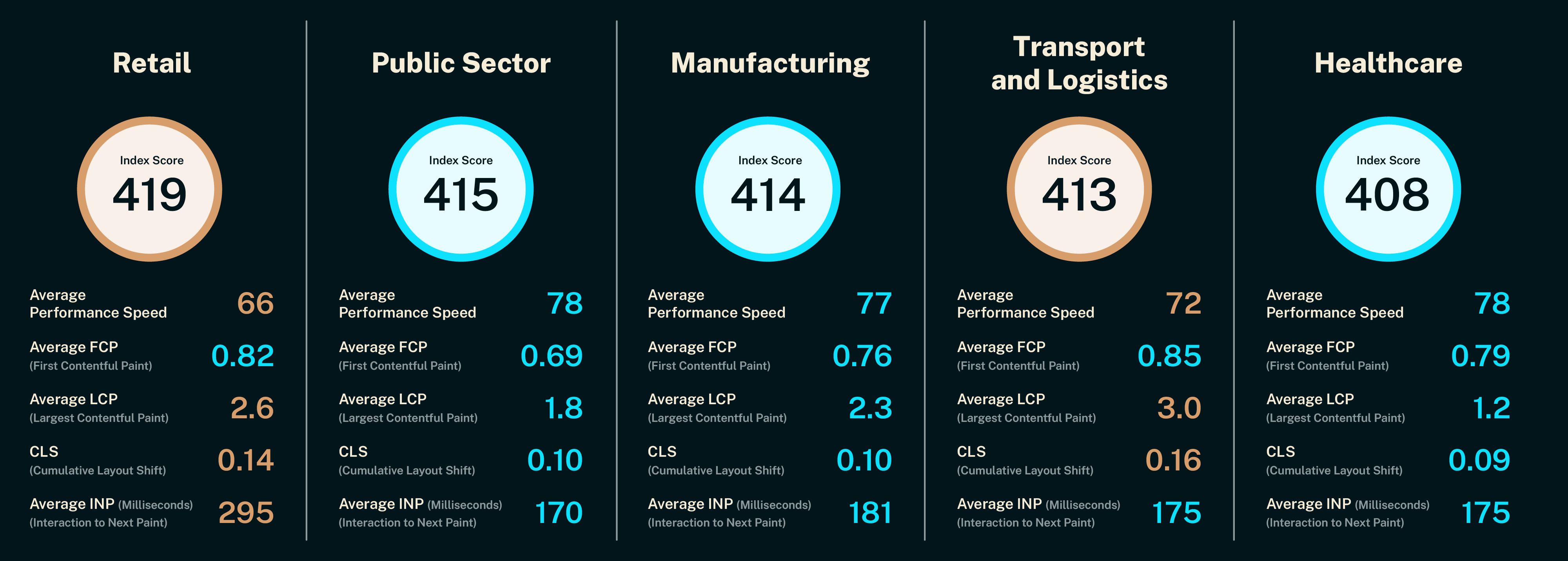
Sectors with the best websites
Despite being let down by fashion, the wider retail sector has achieved top spot as the sector with the best performing websites. Its average performance score is higher than fashions at 66 and its LCP (Largest Contentful Paint) – the time it takes the largest piece of content to load – is lower at 2.6 seconds.
The public sector has the second best websites with the highest average performance score of 78 (along with healthcare and charities). It has a low LCP at 1.8 seconds, paired with a low FCP (First Contentful Paint) – the time the first piece of content takes to load.
Manufacturing comes in third with an index score of 414, followed by transport and logistics. But healthcare has some impressive results – its average LCP is the lowest of all sectors, so its biggest piece of content is fast to load, and its CLS is low, so websites have excellent stability.
“The data reveals that fashion websites are slower to react to interactions, which is in part the reason why websites are lagging behind. Speed matters and not just for brands trying to outpace competitors. Slow sites, which I’m sure everyone has experienced, are frustrating especially when you’re in the middle of an action.
“In 2025, if your website’s UX isn’t up to scratch, visitors have plenty of alternatives. Websites do need to look pretty but this shouldn’t be prioritised over functionality or accessibility, otherwise you risk being penalised by Google and visitors.”
— Mark Fensom, Director at Warbox
Expert insights: How to level up your website
There are a number of strategies brands can use to improve their website’s site speed and user experience. Enhancing its accessibility/readability is one of them, along with SEO and conversion rate optimisation (CRO). We asked our specialists, and experts at our sister-agency Tank, for their top tips:
Accessibility

Owen Mumby-Harrison, senior developer at Warbox, explains, “Good accessibility is a must if you’re trying to please both Google and site visitors.” Not only is accessibility a requirement under the Equality Act 2010, it ensures that everyone can access your services.
Owen’s top tips:
Colours: “Colour contrast is a key aspect of accessibility guidelines, so make sure your website colours enhance the readability of text. Light grey on white, for example, can make text impossible to read, while white on black, offers a better contrast. But colours shouldn’t be 100% black or white – use darker grey with off-white text to improve readability for people with dyslexia or astigmatism.”
Interactive elements: “Features like image carousels need to be easy to navigate or include a brief explanation on how to use. Something as simple as a navigation arrow, instead of swipe or click and drag, can reduce friction.”
Visuals: “For websites with blocks of text, add graphics or pictures to improve readability and make it look less imposing. These should be constrained to 60-70% of the page, so people’s eyes don’t need to move as far when reading, which is critical for visitors with dyslexia or ADHD.”
SEO

“UX and SEO are no longer separate disciplines, they're two sides of the same coin,” explains Jake Cassedy, SEO lead at Tank. While an SEO strategy aims to get traffic from organic search, improving the experience for users when they land on your site is essential to achieving that goal.
Jake’s top tips:
Mobile first: "If your mobile site is slow or hard to use, you’re not just losing users, you're effectively giving up your spot in search engine results pages (SERPs). Google indexes websites mobile-first, so poor mobile UX results in poor visibility.”
Page speed: “Page loading speed is a ranking factor. If your site feels slow to load for you, Google has probably noticed that too. That hurts your organic visibility and your bottom line.”
Navigation: “To perform well, your content needs to be discoverable, accessible and engaging. Good UX helps users (and search engines) find what they need fast. Clear site structure and intuitive navigation will improve the performance of your most important pages.”
Conversion rates

“You need a fast website journey to achieve a good conversation rate,” says Dani Betts, CRO lead at Tank. Conversion Rate Optimisation (CRO) is a strategy that enables brands to achieve sales, downloads or sign-ups because every inch of the website is designed based on customer needs and preferences.
Dani’s top tips:
AI content: “Websites often introduce features like chatbots, video or AI, without assessing how it will affect load speed and conversions, which it typically causes to drop. Although integrated tools and software can help to improve the customer experience, the solutions should be optimised for your website otherwise it will increase overall journey times.”
Testing: “Before rolling out any new content on your website, check how the integration will work and test it on a staging site. A/B testing is another method used to improve page layouts and content for visitors by publishing two versions of the same site to find out which is better.”
Page bloat: “As well as ensuring your website is mobile friendly, it needs clear call-to-actions and pages can’t be bloated, which you can reduce by compressing files or shortening scripts.”
Glossary
Core Web Vitals are the metrics that Google uses to assess a website’s performance including its speed and user experience. These include:
Average performance score: Score out of 100 given by Google’s PageSpeed Insights tool, which speaks for its overall performance. The best websites will score between 90-100.
First Contentful Paint: FCP measures (in seconds) how long the first piece of content on a website takes to load as a visitor enters the website. The lower the score, the better.
Largest Contentful Paint: LCP examines (in seconds) how long it takes for the biggest piece of content on your website to load. Again, the lower the score, the better.
Interaction to Next Paint: INP is a metric that assesses (in milliseconds) the response time to interactions made by a visitor. For example, if they click on your homepage or engage with a video. A low score is best.
Cumulative Layout Score: CLS measures how much your content jumps or moves while the page is loading. Anything below 0.1 is considered good.
Methodology
Warbox used five core metrics from Google’s PageSpeed Insights tool to compile an average index score for each industry analysed, based on the UK’s top 100 websites based on traffic figures by sector.
Each of the five metrics are outlined in the glossary above and were given an equal weighting to determine an industry score out of 500 for each.